
When you search Google images for “UX design process” you’ll probably see something a little like this:
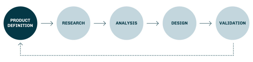
I wish the UX design process was that simple. In my experience it looks more like this:

Yup, that’s right! It’s a mess. Just the sight of it makes the control freak in me break out into a sweat! But that’s what user experience is - a messy road full of infinite twists and turns.
In this article, I’m going to tell you about a project with a process that has been, what my mother might say, "messier than a bowl of spaghetti." At OpenCraft we’re in the process of building a theme that we hope will live up to the Open edX promise of “delivering inspiring learning experiences.” We want the experience to delight course creators and learners alike. To do that, we’ve had to discover what these users really want and need. In the end, we hope this theme is not only beautiful to look at, but also removes barriers, and creates a delightful learning experience.
So let’s dive in and see just how messy the process has been so far.
To kick off the project, my team and I undertook a little UX espionage. Granted, I’m no James Bond; there are no tuxes, gadgets, or martinis; well, at least not until lunch time 😉. My spycraft normally involves a comfy chair, coffee, and a fast internet connection. My mission: evaluate the competition. This is a great way to see what can be emulated and what should be avoided. After all, we don’t want to make the same mistakes that other services have made, nor do we want to miss out on the insight we can gain from their UX victories! In other words “Don’t reinvent the wheel; redesign it!”
There is certainly no shortage of inspiration out there. We were particularly inspired by the edX, Coursera, Udemy, and HubSpot’s UX strategies. Here’s why…
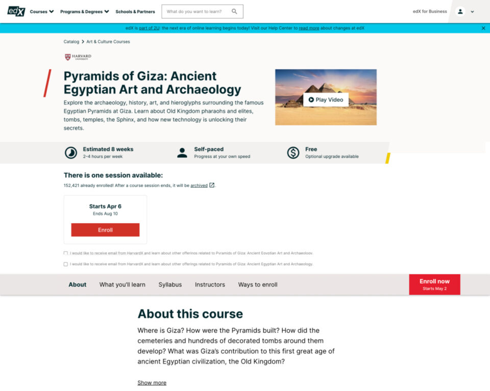
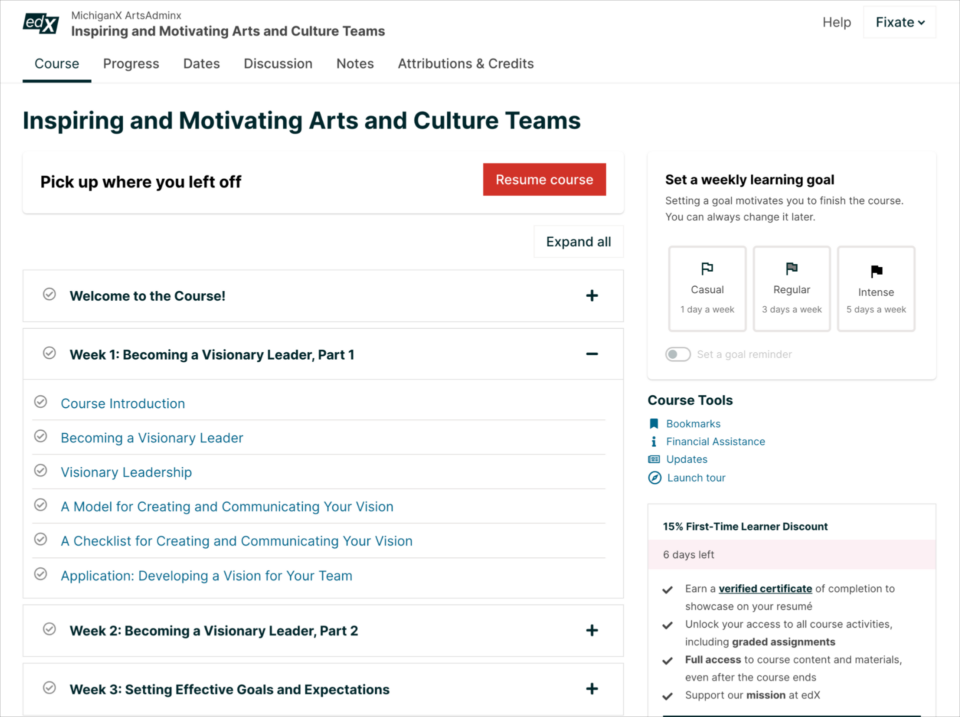
Why we liked the edX Course Overview page:
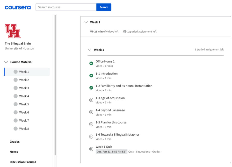
Why we liked Coursera’s learning area:
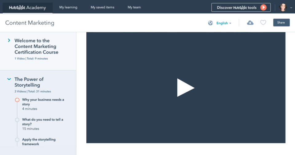
Why we liked Hubspot’s course navigation:
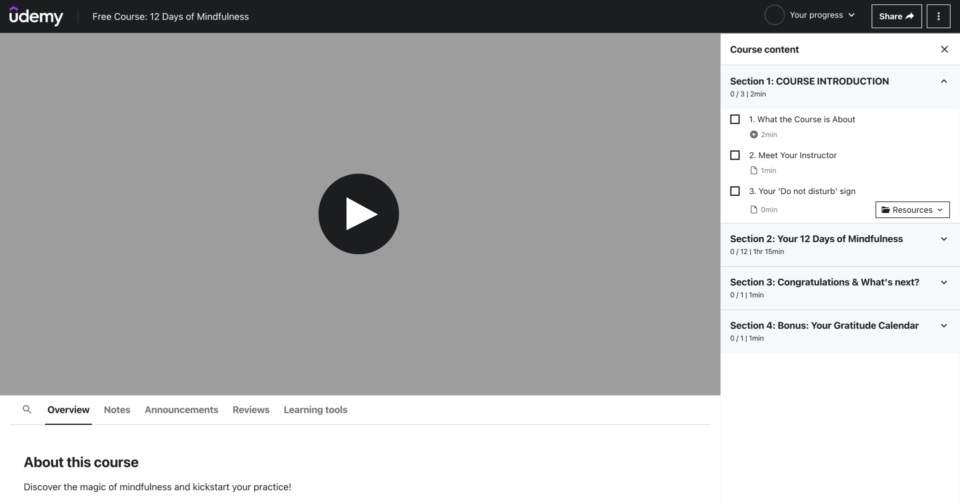
Why we liked Udemy’s learning area:
The intel gathered when scoping out the competition is a nifty way to get your creative juices flowing ahead of the design phase. But before starting the design, it’s important to check in with your target users. That intel can be pure gold.
If we don’t speak to our users, we’re just guessing what they need, what they want, and how they’ll interact with a product. User research is key to building successful products. It can feel like a massive undertaking, but it doesn’t need to be. With just a little effort you can gain valuable insights. In the case of this project, we turned to the Open edX community. I posted a thread on the Open edX forum hoping to get some input.
The feedback we received was eye-opening and incredibly useful. Here are some of the major points that came up:
A picture was starting to form in our minds, summarized nicely by what one user said, “The interface should get out of my way so I can focus on learning.” The design shouldn’t distract learners from their learning goal; it should help them achieve that goal. Users are there to learn, not to be wowed by interesting design or distracted by fancy animations.
At this point in the process we needed to take everything we’d learned and start designing.
I’ve found that the best way for me to process user research is to start with wireframes. It’s a great way to throw all your thoughts on a page so you can start aligning concepts according to user feedback.
We started with the most important part of the interface first: the learning experience.
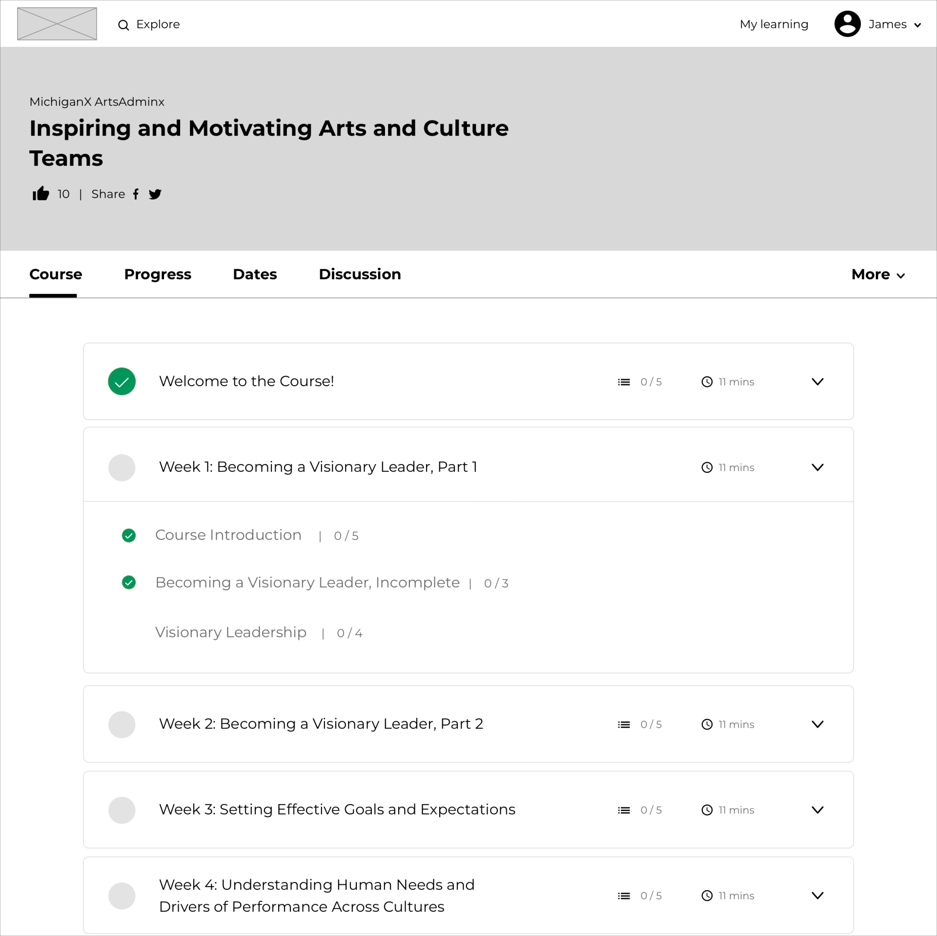
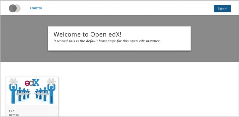
You might be familiar with the edX interface below; this was the major source of inspiration for our first attempt.
We kept edX’s basic layout but simplified it. This is the resulting wireframe:
Here’s what we did:
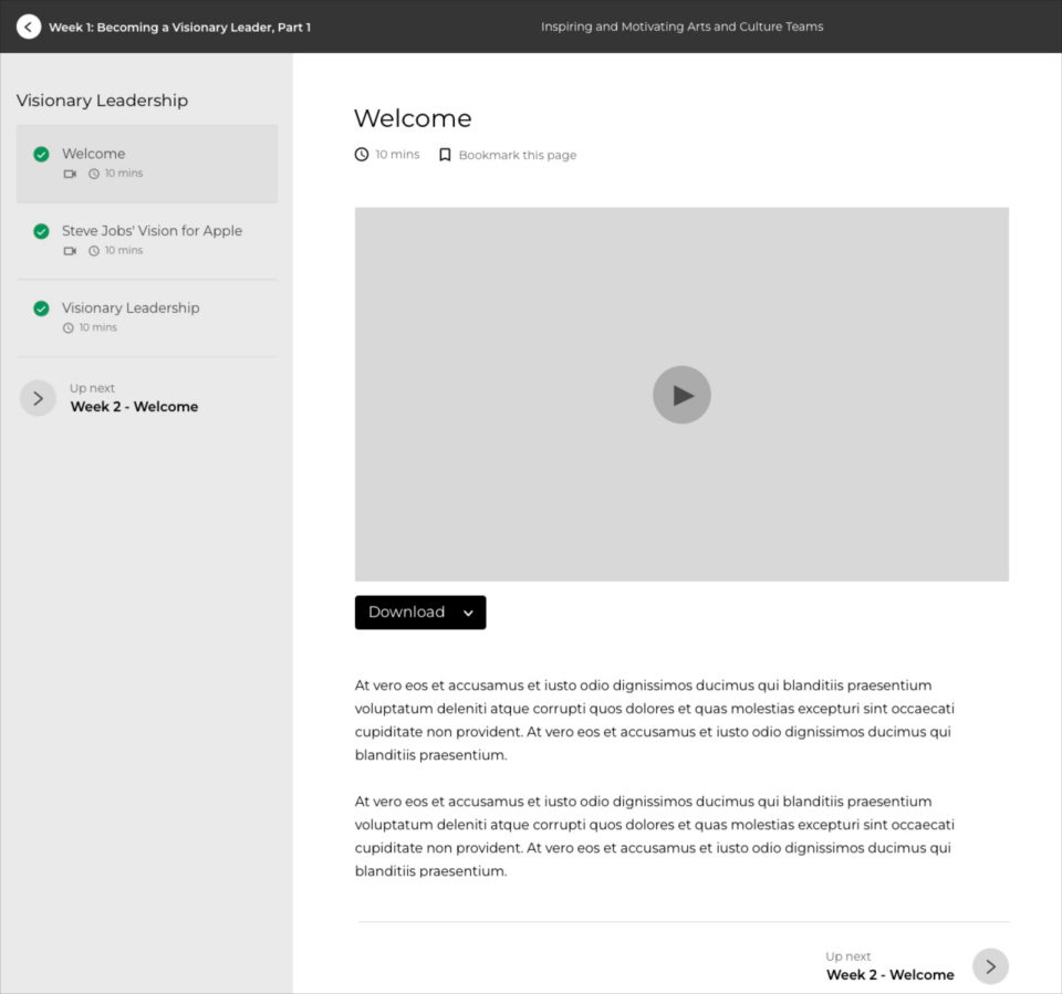
Overall, this attempt felt clean and distraction free. But now we had to decide what would happen if a user selects a section, like Visionary Leadership, for example. This is what we came up with:
As you can see a full-page drawer appears over the Course Outline page with a sidebar that clearly labels the contents of the section. And to minimize distraction, we’ve removed items that aren’t essential. So the site’s main navigation is replaced by the course title and section title.
The next step was to explore how the designs would translate to mobile:
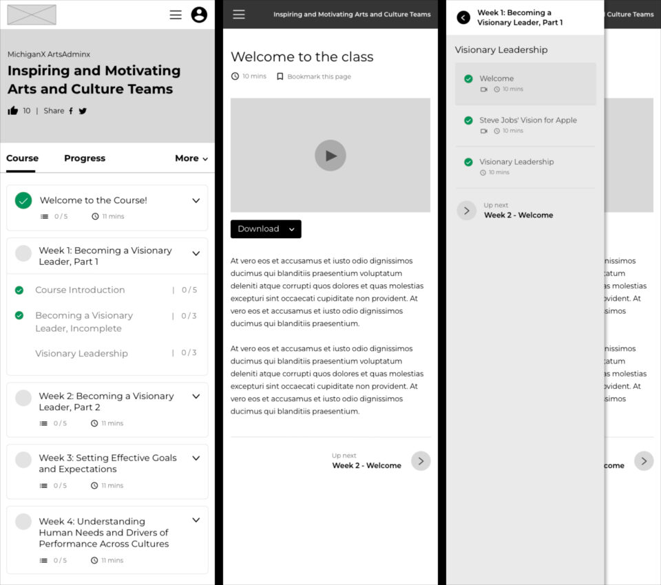
As you can see:
Overall, we really liked this attempt, but we felt we could do even better. After countless iterations, we came up with the latest version of the wireframes. Here’s what they look like:
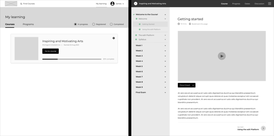
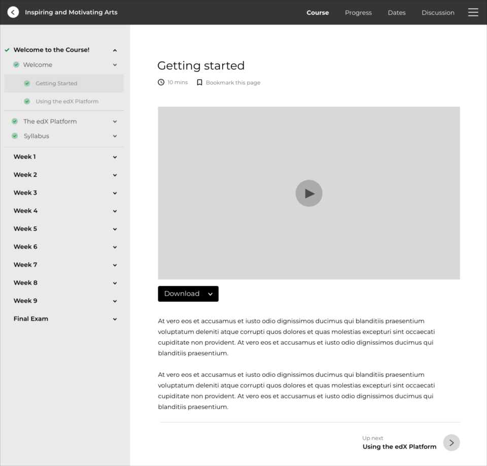
Once a user has selected a course from the My learning page, they are navigated to a distraction-free course page, where everything relates to the learning material. The main navigation is gone, and in its place we have a simple course navigation. If the user wants to exit the learning experience, they can easily do so by selecting the back arrow, located at the top left of the page.
Let’s take a closer look…
This wireframe aligns nicely to the user research we initially gathered, because:
The design was a clear winner! The next step was to see how it would translate to mobile:
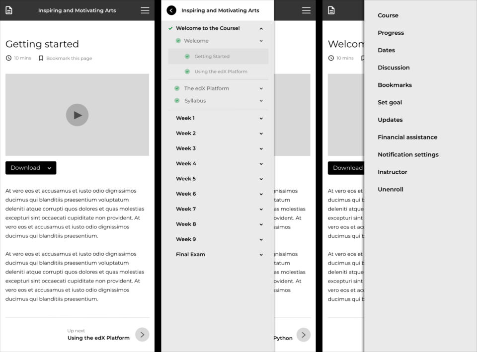
Mobile feels clean and uncluttered. We have one page with two icons in the main navigation. One links to the Course Outline, and the other, the Course Menu.
With a basic idea of how the learning experience would work, we moved on to some of the other key pages.
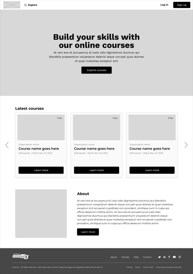
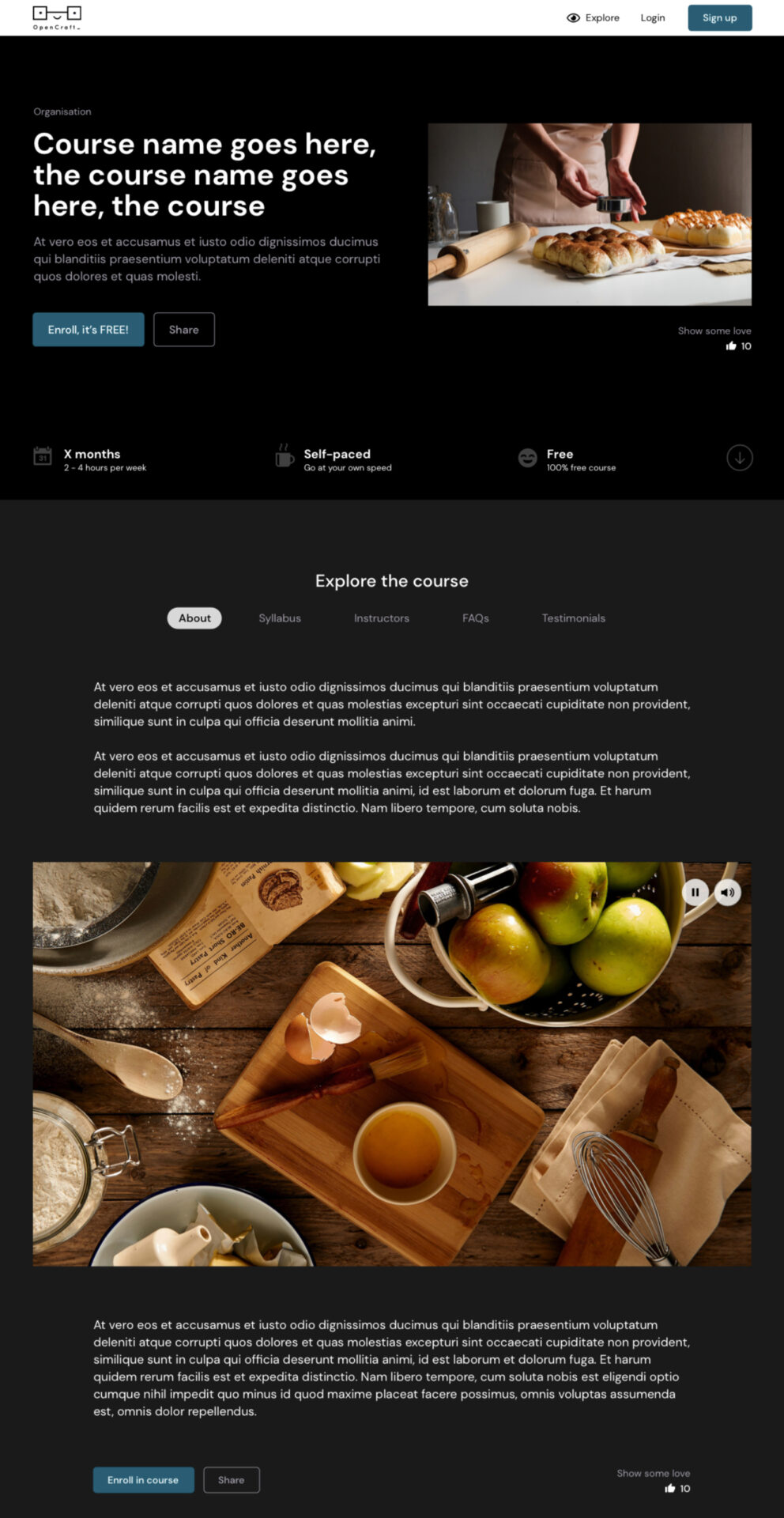
The theme Home page is the perfect place for course creators to market their courses. It sets the tone for the learning experience.
We took this:
And gave it a bit of a user experience facelift:
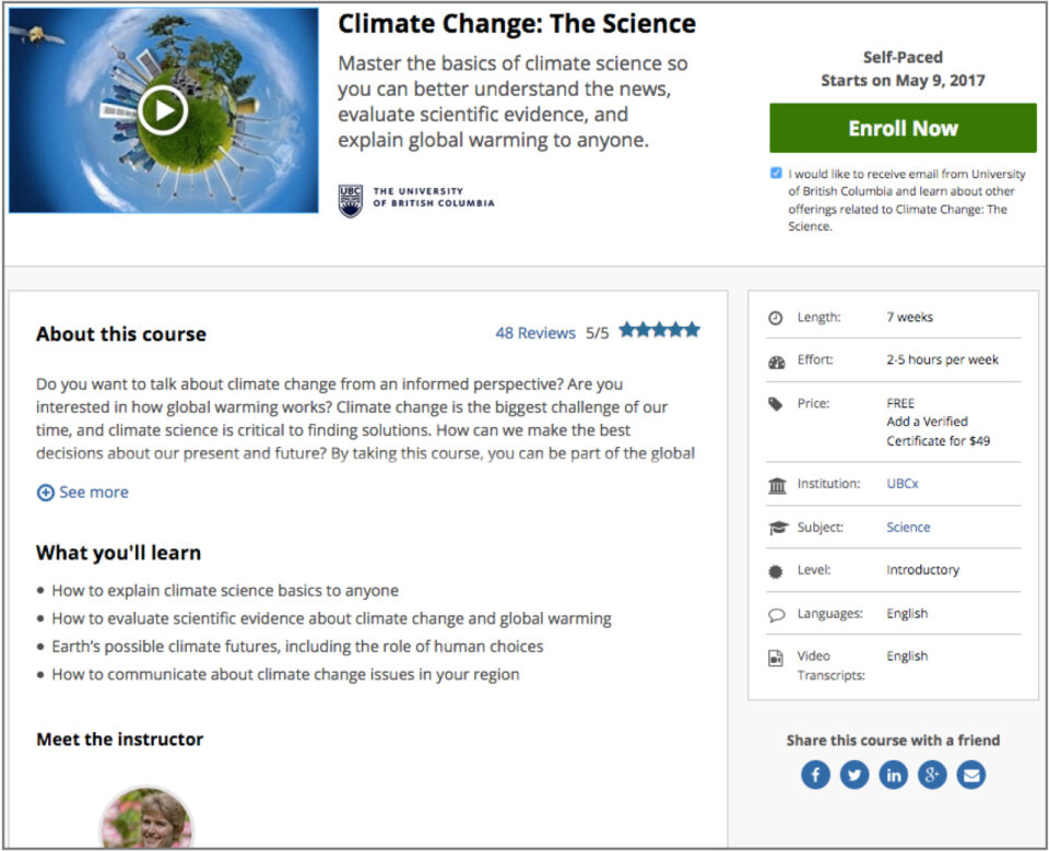
From there, we worked on the Course’s About page which provides learners with information about a course. Some of you might be familiar with the current Lilac Release of the Course About page:
Our theme’s version of the page will look something like this:
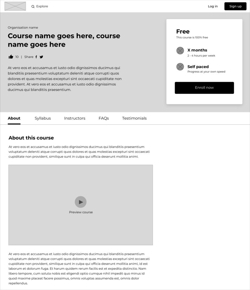
The design feels clean and simple, and highlights all the key course information right at the top of the page.
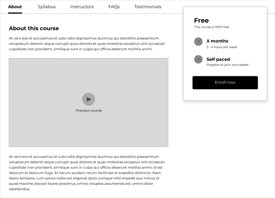
When users scroll down, the sub-navigation sticks to the top. This makes it easier for people to navigate through the course information no matter where they are on the page. To make it even easier, we decided the course price and length should stick to the top too; that way, this info is always visible and the user can enrol at any time.
With some key areas of the theme wireframed, it was high time to check in with our target users. Taking baby steps, we decided to dress up the theme Home page and Course About page to see how users responded. This was the first look-and-feel of the Course About page:
Nothing too groundbreaking! We quickly went back to the drawing board to see if we could push our design limits a bit more.
In our next attempt we envisioned a theme with two color options which users could modify if they wanted to:
It was time to test the waters - we wanted to know how people felt about this design direction. This is some of the feedback we received:
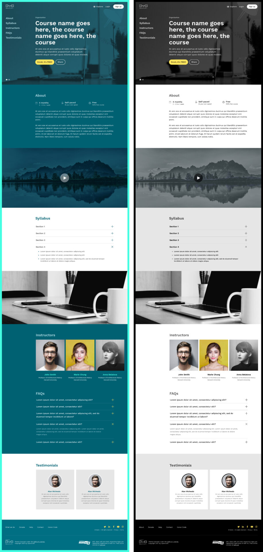
This was great feedback! So we wiped the slate clean, yet again 😂, and created a "light” and “dark” version of the theme. This will give users the choice of two neutral bases to work with.
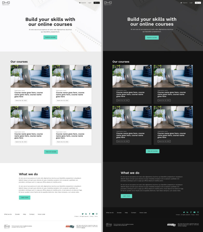
Here's the top section of the "light" version of the theme:
Here's the top section of the "dark" version of the theme:
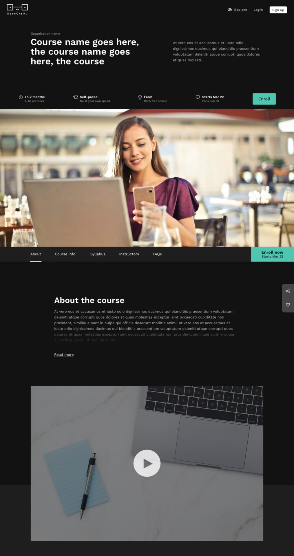
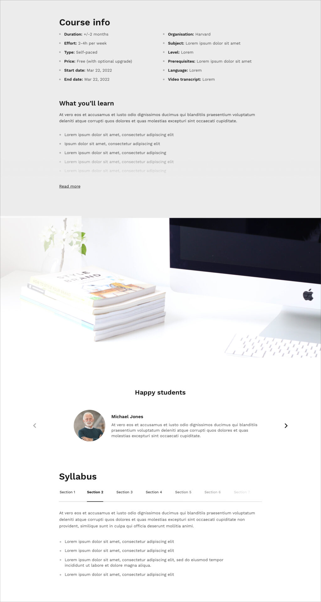
Here's another section of the "light" version of the theme:
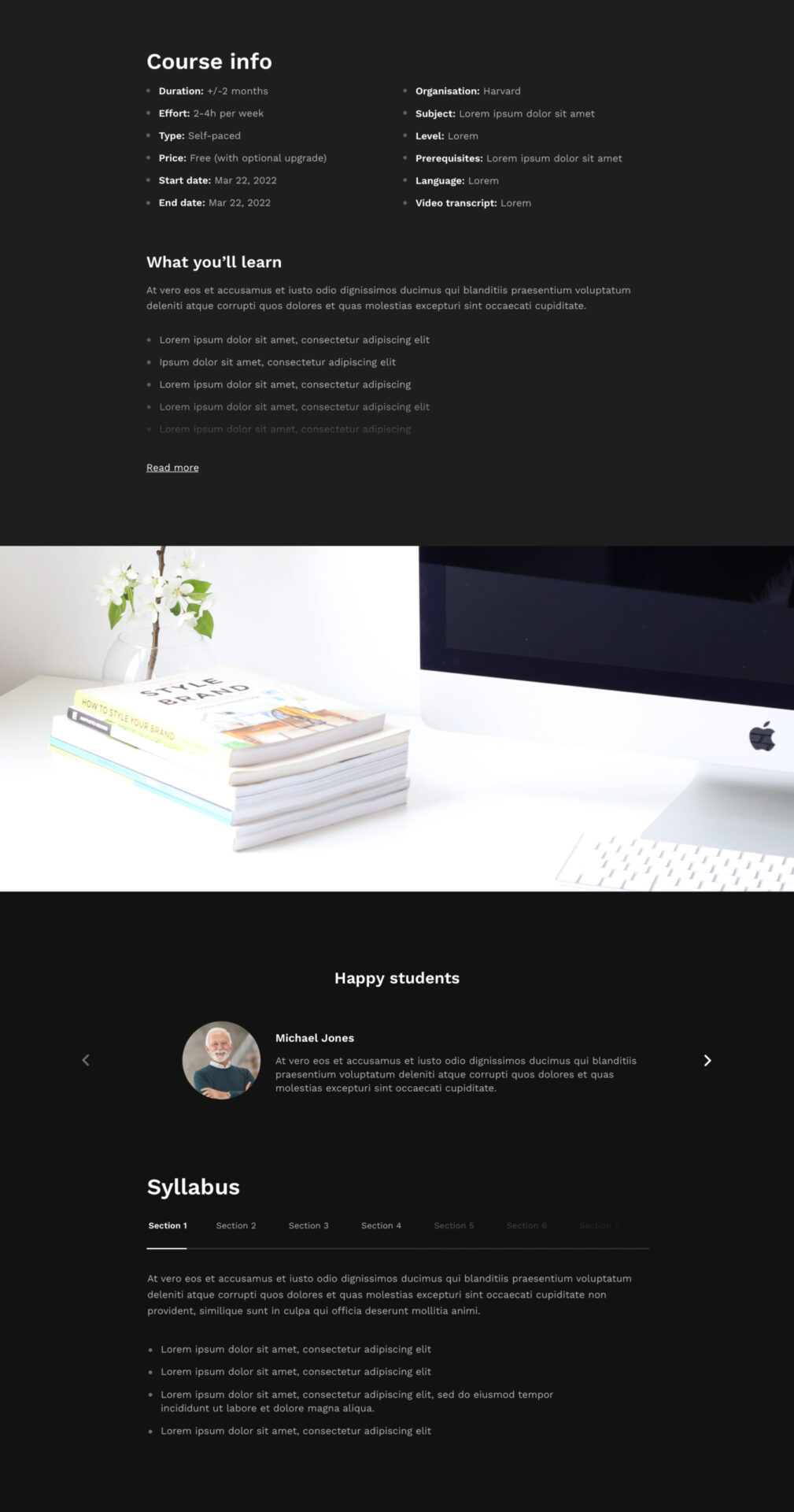
Here's the same section in the "dark" version of the theme:
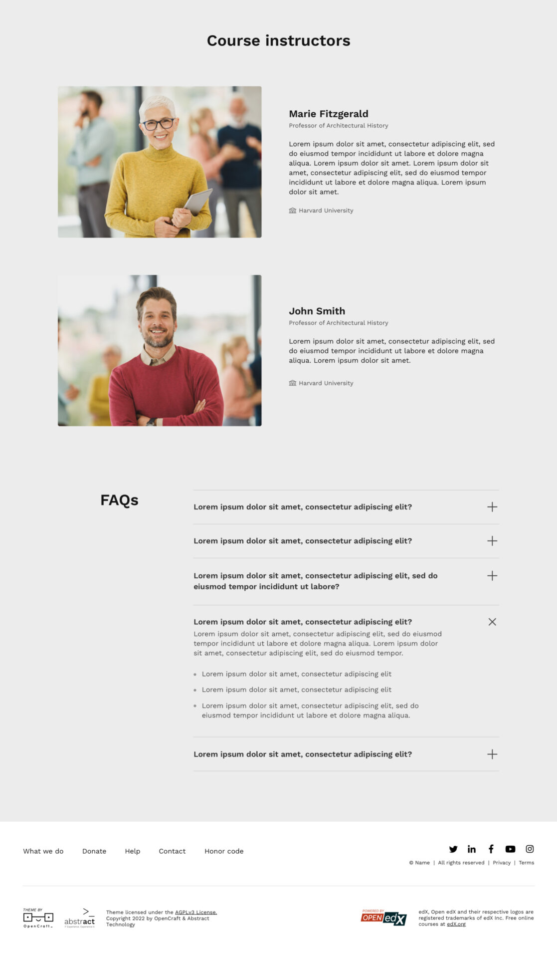
Here's the bottom section of the "light" version of the theme:
Here's the bottom section of the "dark" version of the theme:
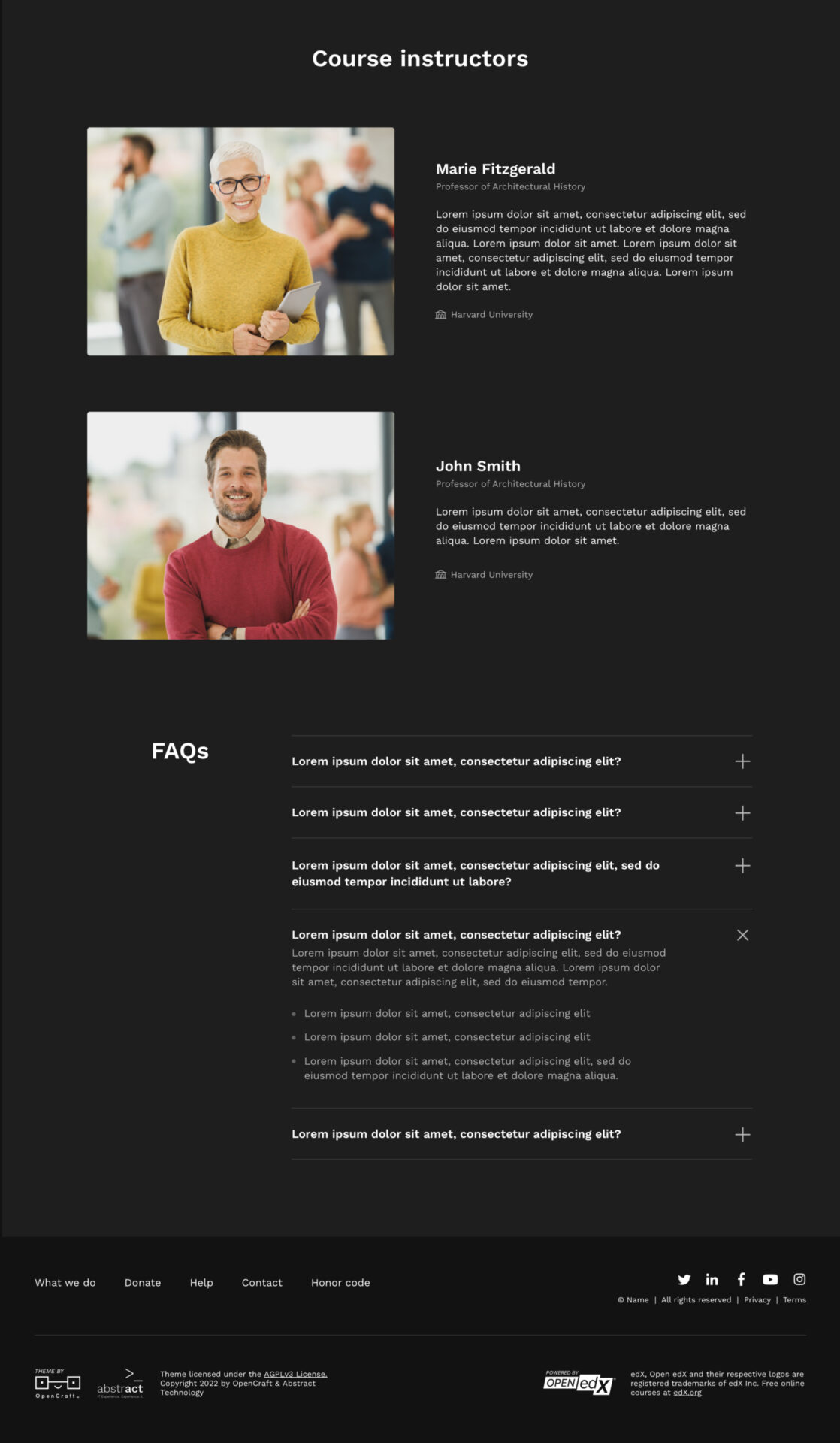
Here’s what’s changed:
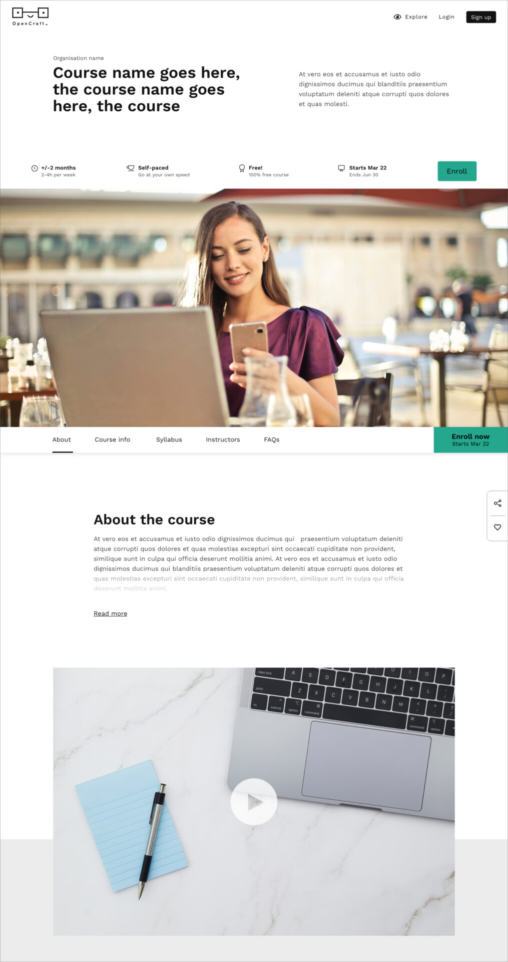
Generally, we’ve received positive feedback on this new aesthetic. Here’s how this look-and-feel has been applied to the theme Home page:
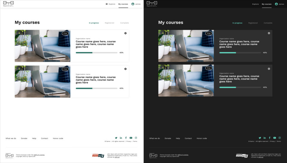
And here’s the design applied to the My Courses page, where users manage their courses:
Now that we have a solid design direction in place, we plan to make some good headway on development. This will allow us to have a clickable interface to test with our users. While the developers are hard at work, our design team will flesh out the rest of the theme.
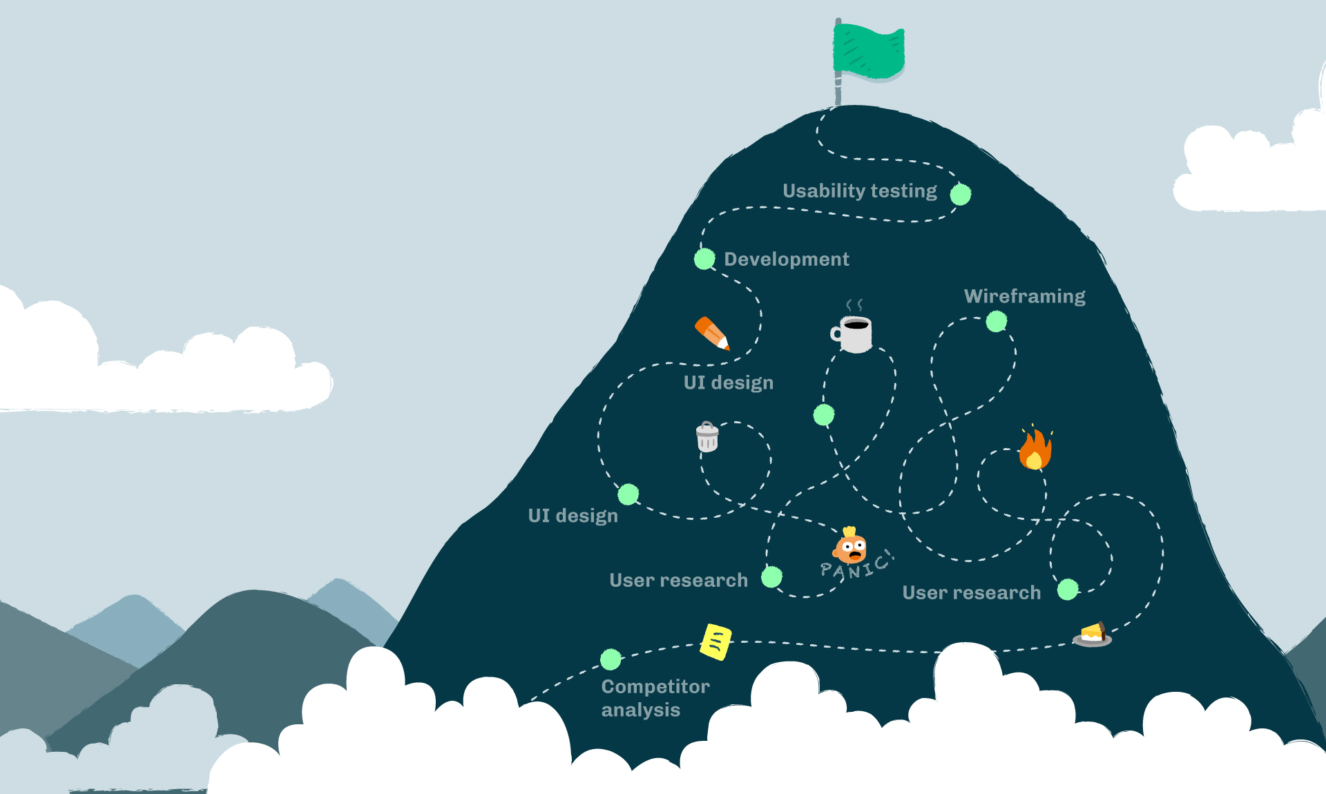
We still have a fair way to travel on our epic mountain journey. Although the climbs will become less steep, and the rocks less icy, the UX process is never truly over. I hope by sharing our messy process, you are reassured that things don’t always have to go as originally planned. You can veer from the path as long as you follow the continuous process of testing, tweaking, retesting, and improving.
Here’s to designing better user experiences for all edX learners!