
The Open edX platform is a large open source project that has been around close to a decade. The web changed in the years from its initial release. In particular, frontend technology advanced to the point where dedicated applications can be built in JavaScript. To keep pace, the community has adopted the use of "Micro Front Ends" (MFEs) to replace the aging interfaces of the platform. With this technology, teams build custom interfaces for the Open edX platform. We've covered a couple of these MFEs in previous articles, like Publisher and the Editable Gradebook. Itching to make your own custom experience? We'll teach you how to build your own Micro Front End.
If you're used to working with JQuery and Django templates, you may find the list of new technologies daunting. Building frontends in React is a radical departure from the old way of building user interfaces for the platform. Thankfully, a prebuilt template exists to help you get started. Visit the template page and hit the 'Use this template' button to create your own copy of the template repository on GitHub. Some basic familiarity with the platform, the command line, and JavaScript is required.
We will be going over several technologies quickly on a surface level-- you'll need to study further to grasp everything. That said, this should help you set up an MFE of your very own and get you pointed in the right direction.
Once you've created your copy of the repository, it's time to clone it. I've created a new repository called demo-mfe, so I'll clone it this way:
git clone https://github.com/open-craft/demo-mfe.gitOpen up the resulting code in your favorite IDE or text editor. We'll start by following the instructions in the template README. First, we'll replace all references to the template repository with references to our own. So, we find edx/frontend-template-application and replace it with open-craft/demo-mfe. Then we search for the string absent the GitHub username, replacing frontend-template-application with demo-mfe.
One more thing you should do while you're here-- take the example file, README-template-frontend-app.rst and replace the README.rst file with it. Update that file according to the instructions. It will give you a great way to organize basic information about your project so newcomers know what it's for and how to use it. If you need the information in the old README.rst, just refer back to the old template repository, or revisit the initial commit.
Now that you've done your initial customization, it's time to install and run the dev server so you can begin work:
npm install
npm startNOTE: If you are getting a syntax error from npm start, you may need to upgrade your version of node.
The prompt will tell you that your application is available at https://localhost:8080/, and it is, but it won't run until you start your devstack. Start up your devstack with the LMS, and then view the page, and you'll see your MFE!
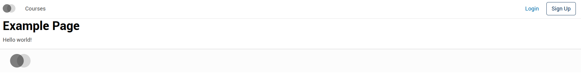
This example page isn't much to look at, but there's a lot here. You'll notice there's a standard header and footer, which handle login and registration (mostly, just pointing to the relevant pages on the LMS.) You can log into the LMS and return to your MFE, and you'll see that the header changes:
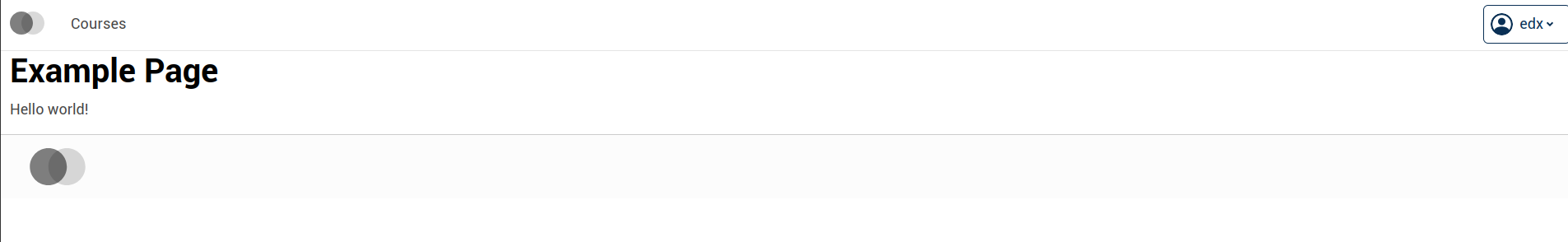
edx.Let's do something simple-- let's fetch the course catalog and see what courses are available on the LMS. Start by creating a new directory under src named catalog, and another one named common. We'll want to create a few files here. We'll talk a bit about each file, but if you want to read an in-depth explanation about the directory structure, you'll want to read this document. Here's the structure we'll be making for catalog:
$ tree catalog
catalog
├── CatalogPage.jsx
├── data
│   ├── api.js
│   ├── selectors.js
│   ├── slice.js
│   └── thunks.js
├── index.scss
└── messages.js

1 directory, 8 files
...and here's the structure we'll make for common:
$ tree common
common
├── constants.js
└── store.js

0 directories, 2 files
The very first file we'll create is common/constants.js, which will define a few constants we'll use later.
// Add new names for new features as you build them. This allows you
// to separate out redux state into named areas
// to avoid putting everything in the root.
export const STORE_NAMES = {
  CATALOG: 'catalog',
};

// Right now we have our built-in home view that we'll keep just
// to have something at / when testing, but you'll want to
// be thoughtful about what URL you want to have all your
// action at. After all, MFEs can be configured to be on the same
// domain as the LMS, and so a web server like NginX can proxy
// the request to your MFE if it matches the route.
//
// The LMS has no route at /catalog/, so we'll use that.
// To learn more about react routing, check out https://reactrouter.com/
export const ROUTES = {
  HOME: '/',
  Catalog: {
    HOME: '/catalog/',
  },
};
We'll come back to those constants later. For now, we'll move on to catalog/data/slice.js. This file will contain information defining the data we're using and how the MFE should handle it through Redux. Redux is a state management system. We'll not go too deeply into how Redux works, but one team member describes it this way:
Redux helps you keep different parts of your application isolated by acting as the go-between. For instance if you have a button that can show/hide a sidebar, with Redux you'll dispatch an action, let's call it "SHOW-SIDEBAR". You will write code called a reducer which will accept the original state, and the action, and return the new state that results after that action. Here when it sees the "SHOW-SIDEBAR" action the reducer might change the state to set a variable called "sidebarVisible" to true. Finally, your sidebar component can subscribe to changes to this variable so it can show up if that variable is true.
All of this is handled seamlessly and transparently by Redux, so other than some boilerplate, you're just writing normal functions and accessing normal variables.
-Kshitij Sobti
To make things easier, we'll install the Redux Toolkit library:
npm install -s @reduxjs/toolkitFirst, we want to define our initial state:
export const initialCatalogState = () => ({
  fetching: false,
  errors: [],
  courses: [],
});
We make this declaration a function so we can call it both during initialization and during tests. This ensures we're not using an old copy of the structure with leftover data. Next, we need to define our reducers. Reducers are functions that mutate state.
export const baseCatalogReducers = {
  fetchCatalogRequest(state) {
    state.fetching = true;
    state.errors = [];
    state.courses = [];
  },
  fetchCatalogSuccess(state, { payload }) {
    state.fetching = false;
    state.courses = payload.courses;
  },
  fetchCatalogFailure(state, { payload }) {
    state.fetching = false;
    state.errors = payload.errors;
  },
};
Finally, we'll want to create the slice object we'll use to manipulate state:
import { createSlice } from '@reduxjs/toolkit'
import { STORE_NAMES } from "../../common/constants";

...

const slice = createSlice({
  name: STORE_NAMES.CATALOG,
  initialState: initialCatalogState(),
  reducers: baseCatalogReducers,
});

export const catalogReducer = slice.reducer;
export const catalogActions = slice.actions;
With the structure of the data defined, and our slice ready, we can create the application's store. This file will be at common/store.js:
import { configureStore } from '@reduxjs/toolkit';
import { catalogReducer } from '../catalog/data/slice';
import { STORE_NAMES } from './constants';

export default configureStore({
  reducer: {
    [STORE_NAMES.CATALOG]: catalogReducer,
  },
});
There's one more step for state management here, and that requires us to create a 'selector.' A selector is an intermediary function that takes the Redux state, selects the most important parts of it (massaging data if needed) and presents it to our components.
This is a little redundant right now because we have only one feature, but if we build more than one, it'll be useful not to have the state of all the other features sent to the one we're working on. Selectors are especially helpful when the state's structure changes elsewhere. In such cases, you only need to update your selector and all the components can stay the same.
We'll create the file at catalog/data/selectors.js:
import { STORE_NAMES } from '../../common/constants';

export default (state) => state[STORE_NAMES.CATALOG];In order to get what courses are available, we need to write a function to pull that information from the LMS's API. We put this in catalog/data/api.js:
import { ensureConfig, getConfig } from '@edx/frontend-platform';
import { getAuthenticatedHttpClient } from '@edx/frontend-platform/auth';

ensureConfig(['LMS_BASE_URL'], 'course API service');

export const getCourses = async () => {
  const client = getAuthenticatedHttpClient();
  const baseUrl = getConfig().LMS_BASE_URL;
  const response = await client.get(`${baseUrl}/api/courses/v1/courses/`);
  // This data is actually paginated. The results object contains
  // the first page. For simplicity's sake, we're going to ignore
  // pagination and just use the first page.
  return response.data.results;
};

export default { getCourses };
The helper functions here make this easy-- getAuthenticatedHttpClient gets an HTTP client that's authenticated to the current user (remember the login button from earlier?) ensureConfig, meanwhile, makes certain that the MFE's configuration has an entry for the LMS. If you look in the .env.development file in the root of the project, you'll see this setting is set.
Now that we have our API call, we need to create our 'thunk' that manages both the call and the change to the state. This is what goes in catalog/data/thunks.js:
import * as api from './api';
import { catalogActions as actions } from './slice';

export const fetchCourses = () => async (dispatch) => {
  try {
    dispatch(actions.fetchCatalogRequest({}));
    const courses = await api.getCourses();
    dispatch(actions.fetchCatalogSuccess({ courses }));
  } catch (err) {
    dispatch(actions.fetchCatalogFailure({ errors: [String(err)] }));
  }
};

export default { fetchCourses };
Note that we send all changes to the state through the dispatch function using the reducer functions we created earlier.
While we could just write the thunk to contain the API call, we use a separate file for the API calling functions because several thunks might call to the endpoints for different reasons.

Those last few files were a bit dry. Now it's time to build the components. React components handle the running and display of your Micro Front End. We will configure these components to use internationalization and the accessibility component library, Paragon.
We need to add one more special file before writing the components themselves. This is catalog/messages.js, which will contain all the translatable strings we'll use later in the components.
import { defineMessages } from '@edx/frontend-platform/i18n';

export default defineMessages({
  catalogHeading: {
    id: 'catalogHeading',
    defaultMessage: 'Course Catalog',
    description: 'The page heading for the catalog page.',
  },
  catalogLoading: {
    id: 'catalogCourseLoading',
    defaultMessage: 'Loading...',
    description: 'Loading message when fetching the courses.',
  },
  catalogCourseView: {
    id: 'catalogCourseView',
    defaultMessage: 'View Course',
    description: 'Label for the button that brings the user to the course about page.',
  },
  catalogCourseBannerAlt: {
    id: 'catalogCourseBannerAlt',
    defaultMessage: 'Showcase image for {courseName}',
    description: 'Alt text for course banner images.',
  },
});
OK. Now we're finally ready to write the component itself. We'll place it in src/catalog/CatalogPage.jsx. JSX is an extension of JavaScript that allows you to drop down to an HTML-like syntax for writing template code used by React. It uses syntactic sugar compile this:
<h1 className="title">"Hello World</h1>...into this:
React.createElement("h1",{className:"title"}, "Hello World")Anyhow, here's our component code:
import {
  Alert, Card, Col, Container, Row,
} from '@edx/paragon';
import { injectIntl, intlShape } from '@edx/frontend-platform/i18n';
import { getConfig } from '@edx/frontend-platform';
import { useDispatch, useSelector } from 'react-redux';
import { useEffect } from 'react';
import Button from '@edx/paragon/dist/Button';
import { fetchCourses } from './data/thunks';
import selectCourses from './data/selectors';
import messages from './messages';

const buildLmsUrl = (absoluteUrl) => `${getConfig().LMS_BASE_URL}${absoluteUrl}`;
const buildCourseURL = (courseKey) => buildLmsUrl(`/courses/${courseKey}/about`);

export const CatalogPageBase = ({ intl }) => {
  // These 'use' functions are React hooks. Hooks let you hook into
  // parts of react like the state management system. You can read
  // more about them here: https://reactjs.org/docs/hooks-overview.html
  const dispatch = useDispatch();
  const { courses, errors, fetching } = useSelector(selectCourses);
  // By providing no dependencies in the second
  // argument, we signal that this hook should be run when the
  // component is mounted.
  useEffect(() => {
    dispatch(fetchCourses());
  }, []);
  return (
    <Container>
      <Row>
        <Col xs={12}>
          <h1>{intl.formatMessage(messages.catalogHeading)}</h1>
        </Col>
        <Col xs={12}>
          {errors.map((error) => <Alert variant="danger" key={error}>{error}</Alert>)}
        </Col>
      </Row>
      {(fetching && (
        <Row>
          <Col className="text-center">{intl.formatMessage(messages.catalogLoading)}</Col>
        </Row>
      )) || (
        <Row>
          {
            // We can get insight into the structure of courses at this
            // endpoint by checking our local copy of it here:
            // http://localhost:18000/api/courses/v1/courses/
          }
          {courses.map((course) => (
            <Col xs={6} md={4} lg={3} key={course.id}>
              <Card>
                <Card.Img
                  variant="top"
                  src={buildLmsUrl(course.media.course_image.uri)}
                  alt={intl.formatMessage(messages.catalogCourseBannerAlt, { courseName: course.name })}
                />
                <Card.Header>{course.name}</Card.Header>
                <Button variant="primary" href={buildCourseURL(course.id)}>{intl.formatMessage(messages.catalogCourseView)}</Button>
              </Card>
            </Col>
          ))}
        </Row>
      )}
    </Container>
  );
};
Note that this component takes an argument, intl. This is the internationalization helper object that we'll eventually pass to the component to do all of the string translations.
Speaking of arguments, we next need to set up the component's propTypes. This helps us define how the component is to be called using a 'soft' type checking system. In development, this will send us messages in the console if we ever call a component without arguments that match the propTypes. We define the propTypes this way:
CatalogPageBase.propTypes = {
  intl: intlShape.isRequired,
};
Because we're using hooks, and this is a simple component, the intl object is the only special object we need to include. However it's worth giving you an example of a more complex shape in case you need it. Here's an example shape for defining an animal:
const AnimalShape = PropTypes.shape({
  media: PropTypes.shape({
    sound: PropTypes.shape({
      uri: PropTypes.string.isRequired,
    }),
    pictures: PropTypes.arrayOf(
      PropTypes.shape({uri: PropTypes.string.isRequired, alt: PropTypes.string.isRequired})).isRequired,
  }),
  legs: PropTypes.number,
  name: PropTypes.string.isRequired,
  move: PropTypes.func.isRequired,
});
This would match an object like this:
{
  media: {
    sound: "https://example.com/woof.wav",
    pictures: [
      {uri: "https://example.com/doggo.jpg", alt: "Picture of a dog in sunglasses."},
      {uri: "https://example.com/doggo2.jpg", alt: "Picture of a dog floating in a pool."},
    ],
  },
  legs: 4,
  name: "Dog",
  move (x, y) => {
      // ...
  },
}
...or like this:
{
  media: {
    pictures: [
       {uri: "https://example.com/sponge.jpg", alt: "Picture of a sponge on a coral reef."},
    ],
  },
  name: "Sponge",
  move (x, y) => {
    // ...
    // slooooowly
    // ...
  },
}
The shape of the intl object is imported at the top of the file from earlier. You can go look at the definition to see precisely how it's constructed-- which properties need to be functions, which ones are strings, which are arrays (and what kind!) React will check all of this for you when running the component. Handy!
Finally, we need to inject the internationalization functionality into the component. It isn't as big of a deal here, but when working with many nested components, if you don't inject intl, you'll have to remember to pass it to each and every sub component. Injecting it this way means we get it passed to the component's arguments for free when we call it later:
export const CatalogPage = injectIntl(CatalogPageBase);The result is a new component with intl always added!
Now that we have all the parts, we need to assemble them in the Micro Front End's index. This is all the way back in src/index.jsx. Here's the contents:
import 'core-js/stable';
import 'regenerator-runtime/runtime';

import {
  APP_INIT_ERROR, APP_READY, subscribe, initialize,
} from '@edx/frontend-platform';
import { AppProvider, ErrorPage } from '@edx/frontend-platform/react';
import ReactDOM from 'react-dom';

import Header, { messages as headerMessages } from '@edx/frontend-component-header';
import Footer, { messages as footerMessages } from '@edx/frontend-component-footer';

import { Route, Switch } from 'react-router';
import appMessages from './i18n';
import ExamplePage from './example/ExamplePage';

import './index.scss';
import { ROUTES } from './common/constants';
import { CatalogPage } from './catalog/CatalogPage';
import store from './common/store';

subscribe(APP_READY, () => {
  ReactDOM.render(
    <AppProvider store={store}>
      <Header />
      <main>
        <Switch>
          <Route exact path={ROUTES.HOME} component={ExamplePage} />
          <Route exact path={ROUTES.Catalog.HOME} component={CatalogPage} />
        </Switch>
      </main>
      <Footer />
    </AppProvider>,
    document.getElementById('root'),
  );
});

subscribe(APP_INIT_ERROR, (error) => {
  ReactDOM.render(<ErrorPage message={error.message} />, document.getElementById('root'));
});

initialize({
  messages: [
    appMessages,
    headerMessages,
    footerMessages,
  ],
});
It may be most instructive to ask git what you've changed here using git diff index.jsx-- we've inserted a few things and taken others away. For one, we've added the router and routing. So, the example component our template came with is available at / and our catalog is available at /catalog/. One more thing we've done is pull in the Redux store and add it into the AppContext. The selector and the reducers to pass around the current state and update it.
With all of that together, we should finally be able to see our finished MFE with the new feature at:
https://localhost:8080/catalog/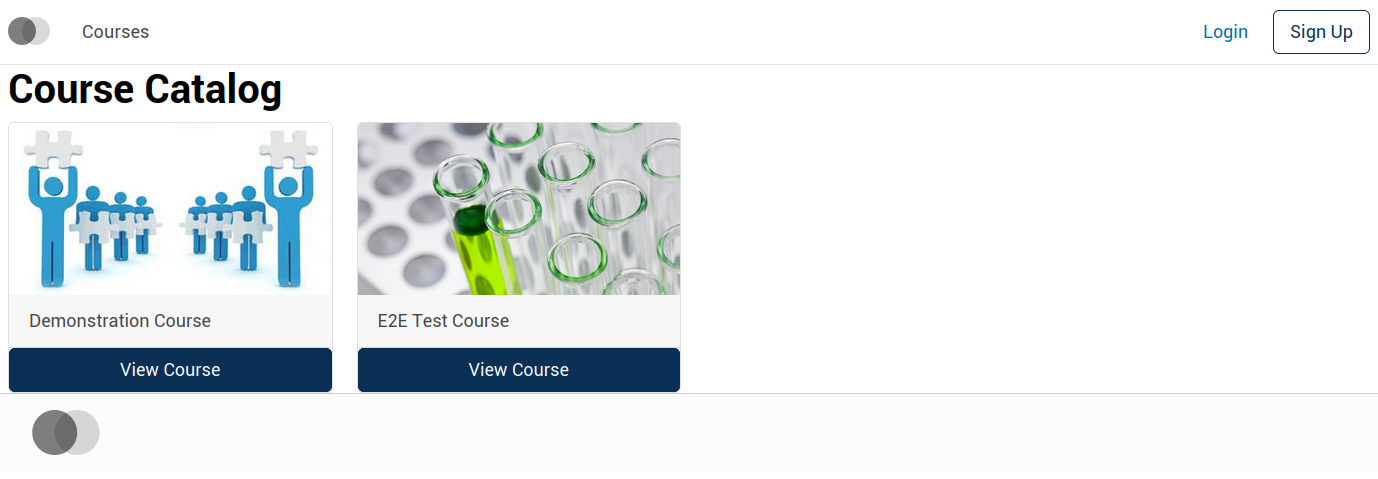
Congratulations! You've surfed through a ton of new technologies, learned a few new best practices, and created your own MFE! Now you can customize your Open edX platform experience however you like. ?